Friday 31 October 2014

Halloween special - How to draw animal ears on people (guest appearance of vampire fangs).

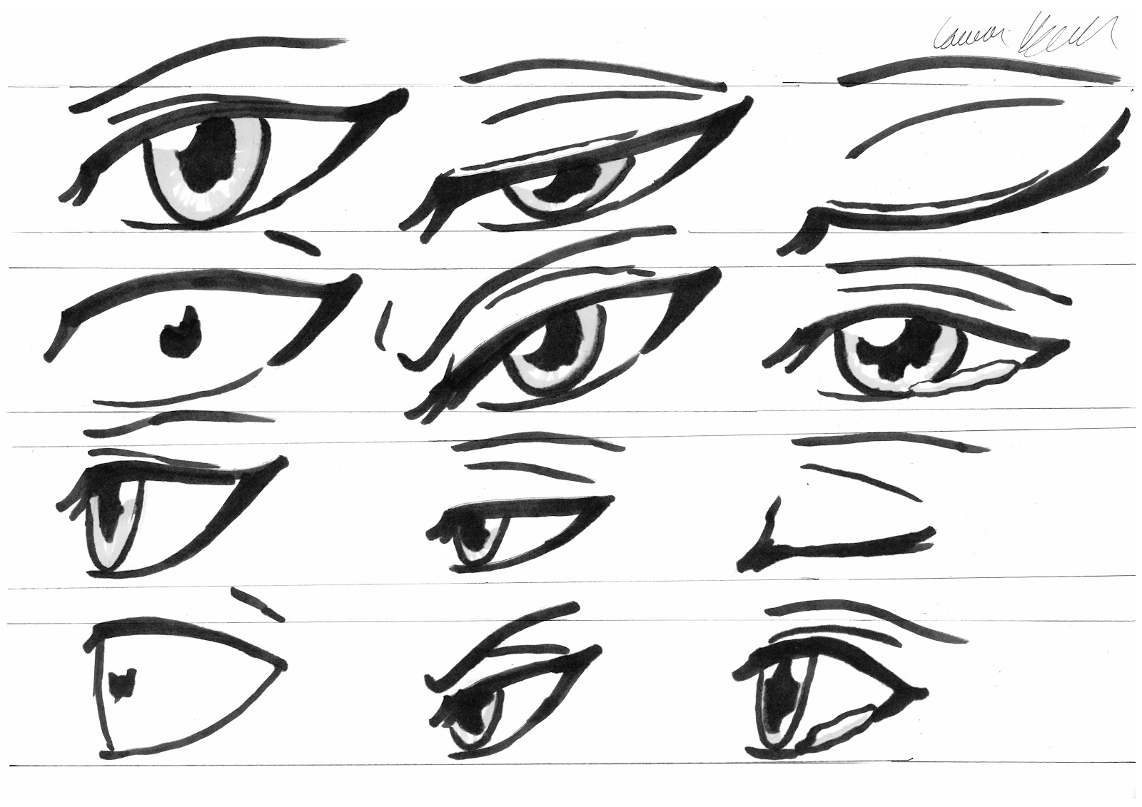
Here is part two of the 2014 Halloween special, animal ears! My character Jamie has a little secret to reveal, he is in fact half kitsune and sports a very large and fetching pair of ears when he isn't hiding them with magic.Ears.jpg
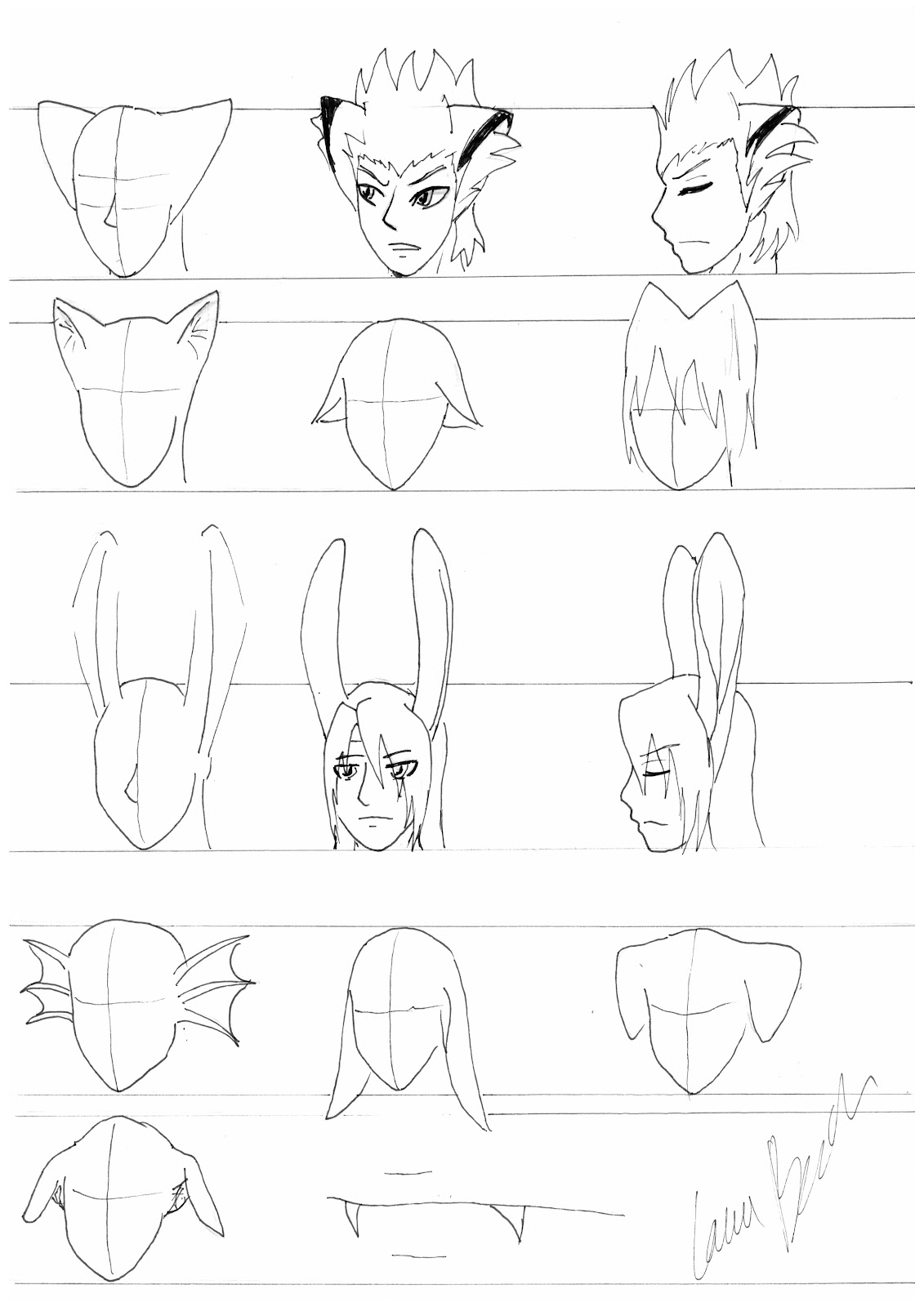
There are as many variations of ears as there are animals, but for the two step by steps I have chosen Jamie (fox ears) and Storm (rabbit/hare ears) to represent triangular and tall respectively.

For triangular ears I recommend drawing the top line first, then connecting back to the head depending on the size and set of the ears. Jamie’s are low set and large. Next a line is drawn to separate the inside of the ear from the outside and the inside is filled with fluff. Jamie has very unique markings in the form of a black ear stripe, when for a fox usually the whole top of the ear would be black. Profile is always hard, here he has the ear tilted back slightly to make things easier.

Below we have high small (perhaps a cat?), low small (drooping sadly) and ‘in hair’ high small triangular ears.

Storm’s hair and ears are usually black, but I have left them white so you can see the detail. For tall ears like this, instead of drawing a topline you draw a ‘support line’ as I like to call it. Basically a representation of the inner centre of the ear (imagine a stick up the middle of a fabric ear holding it up. From there I sketch out the slightly triangular shape of the outer ear. The opening can only really be seen clearly from the side (and here the triangles are on both sides, making a distinctive diamond shape). Note the ‘support line’ actually makes a useful defining line if the inside of the ear can be seen.

Many other ears follow the same pattern when it comes to location. Don't let strange shapes deter you. The 'aquatic monster' ear is three spines joined with curved lines radiating from the rough location of the human ear. Same with the roots of most ears. They often look more realistic if you can draw them where normal human ears go although smaller cat ears especially can look good on the top of the head as well. Construct droopy rabbit ears the same way, just with a little more curve and obviously going the other way! Floppy Labrador ears are drawn top first like Jamies, then curving down into a triangle shape. Greyhound ears are again drawn top line first, then sweeping back up to the main folded section that connects to the head.

Just a pet peeve, I have seem many people draw fangs too large and too straight! Look at my little example to see they are set where your canines would be (obviously) and are curved and do not extend below the bottom lip. These fangs are visible yet elegant to make your vampire as menacing and attractive as possible. ;)

Go get some photo's of animals. Almost any ear can be constructed with the 'top first' or 'support line' method. There are an infinite number to choose from (bear ears, like rounded cat ears, are particularly cute) so go pick an animal and make your own!

Halloween special - How to draw manga animal tails on humans.

Welcome to part one of the 2014 Halloween special, tails! These fabulous appendages come in all shapes and sizes, but are all constructed in a similar way. Don’t believe me? Look below.
Tails.jpg
To start a tail, a line is drawn from root to tip (however long you want). The location of the root is very important. The tail will be an elongated tail bone and thus comes out of the base of the spine, not the middle of the bottom as I have seen people do before. There can be a slightly higher or lower set, but remember it still should still look as if it could realistically be an elongated tail bone (as that is what all tails are after all).  

The only difference is how you flesh it out. For a cat, you flesh it out relatively slim with a squared off end, for a fox or fluffy dog lots of fluff, a devil add a triangle to the end. You can have them short (like the rabbit/hare/deer tail shown here) or long, thick or thin depending on the species. Most of the difference in thickness will be fluff…

Another suggestion, look at the tails above and see if you can make a dragon (thick at base, tapers to tip, scaly) and a horse (just a bit longer than the deer/rabbit but as thin as a cat with long silky hair). The horse should be the most difficult. The ‘dock’ (and thus the movable part) only reaches the ‘bottom of the bottom’ but the hair can be ground length, making it look as though it has very narrow range of motion compared to a fox for example, when it is actually just short.

Get creative and start working on your spooky characters! My deviant art account is http://vulcanvet.deviantart.com/      - don’t be shy, drop a comment and show me your work! I would love to see what tail variations people can think of.

Wednesday 29 October 2014

Eyes, from wide open to closed - reference.


Expression. Such a difficult thing to get right as it involves the whole face in complex ways, but for now some basic expression can be given through the eyes and eyebrows as long as you know how to draw an eye from way open all the way through closed.
Below we have a set of six eyes from the front, and the same set of six from the side.
EyeExpression.jpg
The first eye is neutral for reference, notice the small crease above the eye. This will be useful and it designates the size of the eyeball in relation to the open part. On the second set of eyes, you can see they are half closed (note full eyeball is delineated at the top) but are closed in a sleepy/bored fashion (eyebrow still neutral). Contrast this with the angry eyes directly below where the eyebrow comes down over the inside edge of the eye and an angry crease can be seen on the forehead. Always draw the shape of the complete eye, then you can choose where to put the eyelid at any level. The third eye is closed yet the full shape of the eye is still indicated by the ‘top crease’. The fourth eye is shocked, notice how the pupil can be drawn contracted for extra effect and the eyebrow lifts out of shot. The angry eye we have already mentioned is similar to the half closed, although the shape can be altered slightly to emphasise angularity. The sad eye seems to droop a little on the outside and the eyebrow follows. Here I have added a larger pupil and water welling on the edge.

The eye from the side is shorter and more triangular than when seen from the front.

In order, neutral, half closed (used for sleepy, bored, stern but not angry look etc. depending on the set of the mouth and other features), closed (asleep, bliss, anything when eye is closed), wide open (shock, panic), angry (mostly eyebrows giving this impression) and sad/about to cry.

You can combine some of these for even more options (one shut one open equals a wink or with a grimace  and angry eyebrows maybe pain, the possibilities are endless). I will add a full face expression tutorial when I am less busy and have the time to draw them all. Being a vet student is hard work…

Until then, keep practising with the reference sheets I provide! I am sorry about how ‘reference’ like these eye tutorials are, but I will make it up to you guys with the Halloween special on Friday. See you there!

Picking an eye shape. Rectangular, oval or triangular?

Alright. Now time to look at eyes in some detail. This will be a short set as on Friday I have a little treat for you, a halloween special! Get your spooky on ready but until then, back to eyes. The basic thing to know is there are three main shapes to choose from (with many variations of course), rectangular, oval and triangular. I would use rectangular eyes for cheerful or normal characters, oval for mysterious, serious or Asian characters and triangular for those with a more menacing appearance (perhaps a villain, someone who takes no nonsense or a really serious person, more so than oval). The construction of eyes will not be delved into in that much detail as they are actually very simple, however I will be posting a tutorial constructing a single complex eye in great detail later on. This tutorial is more the basics on different shapes. Just take a good look below.

EyeShapes.jpg
Firstly we see how the guidelines for the eye (see head tutorial) can be used as is or with an oval inside them (at varying angles depending on what type of character we have). The first eye is plain rectangular with a kink in the top line  just over halfway along (outside edges of all eyes here is to the right). This type of eye is literally drawn 'as is' inside the guide. Men don’t tend to have large eyelashes but I like to give most of my men a little point on the inside and out depending on eye shape as they tend to be more feminine. The more lashes, the girlier he will look. Although the iris is round, not all of it is visible so it always looks like a half moon/incomplete circle when neutral.

The row below shows three oval eyes. Notice how the main difference lies in whether or not the lines are smooth (more feminine/kind) or angular and where the eye outline is ‘open’. For Asian characters I recommend the inside of the eye to be closed and the opening on the outside. It just looks more Asian that way. Also tilt can be important. The middle one is ‘straighter’ than the outer two. I give my very mysterious or elven characters tilted eyes and more human characters straighter ones although it is all personal preference. Tilted eyes can also make a character look sly or shifty.

Next we have a straight topped rectangular eye (in contrast to the more open and kinder looking kink topped rectangular eye) followed by two more triangular in appearance. Notice how all of these eyes are neutral but the narrower triangular eyes or straight tops automatically look more serious or angry than the wide or round ones.

The final row gives some more stylised variations on oval and rectangular. In the middle you can also see a more stylized iris and pupil a bit more like the style seem in the works of Matsuri Hino (or my poor imitation therof). I recommend starting with the simple pupil and iris with highlights, then moving on to adding more detail to the iris (lines and shadow) before moving on to study more complex approaches. The detail is usually lost on anything but an extreme close up anyway. In short, pick a style you are comfortable with and suits your character.

Take these three basic shapes and toy with them. Pick a shape carefully for each character taking into account above points. Try to make every characters eyes unique in some way (unless they are related) and really make them reflect the personality within. The next guide today will be on how we can express some emotion with those eyes so you won’t be stuck drawing one facial expression over and over. If you need anything in more detail just drop a comment and I will be happy to oblige.

Wednesday 22 October 2014

How to draw manga feet.

Now we have, feet! (also a request from my sister). These alien like appendages always look so strange because we hardly spend time looking at them. Even if we do we rarely pay much attention. Take a look at the image and off we go (please ignore the faint inking, I drew this during an hour break between lectures this morning and had to use a biro instead of a proper fine-liner as I was a silly sausage and forgot to bring my pen and have to use university scanners, not having any of my own,  so had to do draw with whatever I had).
Feet.jpg
A basic triangle with the top cut off will do as a guide for most situations. The lines here aren’t any particular measurement unfortunately, it depends on how big your character’s feet are (look at the ‘how many heads high’ tutorial for a rough idea). They are just there for me to have some guide on the height or length of the foot (hence why the bottom view looks smaller as the foot is longer than it is high). The most difficult parts of the foot are the toes and the ankles. The big toe is quite large and the other four get smaller in an arc pattern (see bottom left).

All I can say here really is closely observe the examples here and your own feet to get a rough idea for the size of the toes when seen from different angles, the ankle bone closest to the big toe is actually slightly higher than the one on the opposite side and toes are bigger than you think! Other than that it is hard to set proportional rules as the foot doesn’t divide neatly into halves etc. like the hands (roughly) or the body in general. The good news? Most of the time your characters will be wearing wonderful devices known as shoes, which can be constructed around the guide triangle and no need for toes (bottom right)! I recommend you practice your barefoot drawing right away though as you never know when you will need it.

If you have any requests, just leave a comment and I will do my best to post what you need. See you next Wednesday for another set of tutorials/reference guides!

How to draw manga hands.

At the request of my dear sister, The next tutorial will be on hands. Dreadfully difficult little things to draw or so everyone says, but if you ever get stuck remember, you have a pair yourself! A mirror can become invaluable when drawing that awkward pose or angle, just remember that a left hand becomes a right one in the mirror and vice versa. Take a look at the image below.
Hands.jpg
The main thing to remember about hands is they are essentially a flat box with some tubes attached. That’s right. A box with some slightly squared off cylinders attached and a bit of a triangle for the thumb base. Not so intimidating now are they? Seriously everyone stresses about hands when all they require is a bit of practice and patience, (it took me… actually I am not admitting how long it took me to get to my current hand drawing level but it did take an embarrassingly long time so don’t be discouraged). Each space between the line here represents quarter of a head for those wondering roughly how big a character’s hands should be. If you rest your hand against your face your fingers should just reach your brow… at least mine do.

First draw the palm (a box, roughly square for front or back view and much narrower for the sides). From here add lines for four fingers and a thumb, pay close attention to their lengths, the ‘middle finger’ tends to be longer than the other three with the pinky being the shortest. The ring finger and index finger are roughly the same length in women while the ring finger is slightly longer in men (mostly, this is actually my hand and it has more of a male setup despite me being female, exceptions do exist).

Draw some circles for the joints and flesh out the fingers. The thumb will be the hardest part but think of it as a dumpy finger attached to the palm by a sort of triangle. The major palm creases run in an arc from the top thumb joint and another from between the index and middle fingers. Add the creases on the wrist and the fingers and done! Not so hard really is it?  Half the battle is getting the fingers the right length and having some form other than shapeless tubes (which I fail at most of the time). For the top, the only definition you tend to see is around the knuckles, joints (more creases than the underside sort of in an oval) and sometimes the tendons on the back of the hand.

The example here is a right hand but flip them if you need left. I have included some common angles for you to use as reference. Using the images of all fingers down you should be able to draw some down and some up. Use your own hands and a mirror to practice some more. After all, it’s only a box and some cylinders! Sorry if the font changes partway on you guys... the preview changes it even though it is all in the same font, honest! Computers eh? What can you do. *shrugs*

Wednesday 15 October 2014

The manga head from different angles.

Alright, now we have covered the whole body it’s time to start working on the details! Below is an image of the step by step construction of a head at several different angles.
JamieHeads.jpg
Lets start with the straight on view at the top and work down. As you can see, the head can be constructed in the same basic three steps as the rest of the body (I have separated the final step into two here, basic features followed by finer detail).

The most important things to take note of are the hair and the eye line. The hair is not plastered to the head, but is drawn around it and away from it. This style isn't the best example due to the deep spikes, but in general the circle of the hair should always be bigger than that of the head to add volume. The eyes are halfway between the top of the head and the bottom of the chin. It is a common mistake to focus on the face and put the eyes too high which works fine for many of our favourite western cartoon characters but doesn't really work for manga which is much more realistic proportionally.

As for the eyes themselves, they come in many shapes and sizes but the men tend to have smaller more realistically proportioned eyes than manga women. As a rough guide, the inside edges of the eyes should be around the outside edge of the nose. The eyelashes (difficult to tell apart here as the drawing is small but the spikes on the inside edge) can come in a little further than this (as shown here) if your guy has more girly fuller eyes.

The hairline varies, but is usually just below the halfway mark between the eyes and the top of the head even though it obviously isn't always a straight line. This is where your bangs will come from even if they flop down over your character’s face. The nose ends roughly halfway between the eyes and chin, the mouth being just above halfway between the end of the nose and the chin. Human beings seem to work on ‘just about halves’ a lot, so use this to your advantage! The neck is roughly three quarters of the width of the head (don’t make necks too skinny or your character’s heads will fall off! Only joking, but they will look like they are about to fall off).

Looking at the fine detail, you will see lines above the eyes (unless the character is really surprised) showing the full extent of the eyeball as the eye is not fully open. Another line can be used to define the lower lip and even the upper in finer feminine characters in larger drawings (the line above the upper lip in the bottom picture was actually me dropping my pen. I leave any mistakes here to prove we are all human!). The eyes were really quickly done and the detail within a good eye is too complex to mention here (wait for my eyes tutorial) but note the location of the eyebrows and angle of the eyes may change with expression. Take a good look at human ears… they are hell to draw! I find a simple outer top line with an inner not-closed circle works as a good simplification. The final touch will be the muscle/tendon lines on the neck from the corner of the jaw moving down towards the gap between the collar bones.

In order to get the three quarters view, take a good look at the frontal view and the profile. Notice how the ears are about a quarter of the head from the back of the skull? The nose and lips are especially difficult in profile but the same location apply as for the frontal view. If you can grasp the frontal and profile three quarters should be easy! Once you have them all experiment with images of your favourite characters and see if you can draw a whole spectrum from full frontal to full profile. The key thing is to remember that the eyes are a little more compact in profile and slightly different in shape than when seen from the front. The iris and pupil also tend to be squished (taller and narrower) and close to the front of the eye.

The final two, looking up and looking down, are probably the most difficult. The way to do it is look at where the curved line for the eyes in the first step starts and finishes. The same place (on the midline) as before right? Yep. It just curves up or down! From there you can work out the location of the ears (above the eyes when looking down, opposite for looking up,they don’t really move that much as they are close to the centre of rotation) and  the chin. The chin is easy when looking down (it pivots in and only drops slightly, the whole head may also drop if they bend down a little but we will look at that when we get to crazy poses) but looking up is often difficult. I messed up quite a bit here but the general principle is follow the central face line to the location of the chin, and join it to the points of the jaw (level with the bottom of the head construction circle) with a triangle, either facing up or down depending on the degree of elevation. The key is that simple! Connect up that jaw!

Experiment with your own characters (or fanart if adventurous) and keep practising until you get these angles right, then move on to some more unusual stuff and surprise me!

See you next Wednesday for another tutorial!

Notes on different manga face shapes.

To go along with my head tutorial, here are some head and nose shapes for you. They are not much, but notice how the face appears more masculine as the jaw gets wider, and much more feminine when the lines are rounded. There are literally an infinite number of shapes out there so experiment with wider jaws, narrower jaws, angular jaws you can cut yourself on… I haven’t done much with the cheekbones here but you can have them harsh, smooth, a little lower or higher. I recommend collecting images of real life actors you are fond of and examining how their face shape differs from each other and convert some of their more distinctive features into manga form. There is nothing like examining real life people to improve your manga drawing. Failing that have a look at the characters from your favourite manga's. It’s a fun way to practice and you will learn more than I can teach you here so off you go!

HeadShapes.jpg

Wednesday 8 October 2014

Construction from head to toe. Step by step and what goes where?

After deciding how many heads tall you want your character to be (see the ‘How many heads tall should my manga character be’ tutorial), it’s time to start drawing!

You may recognise this character below as the baby on the far right (apologies if the images show up as portrait and not landscape, this seems to be an Internet explorer only thing. If any of the more tech savvy out there know how to fix this please leave a comment). After being de-aged for my purposes he is now back to his usual self for the step by step construction tutorial (looking a little wonky but hey, quick sketches in the evening and all that…). Feel free to follow these steps with your own characters in your own pose, experiment! Practice makes perfect. If you don’t believe me you should see my drawings from 5 years ago...
%5bUntitled%5d.jpg
Just a note, draw softly in pencil at first. You can always ink later. I just had to ink mine or the scanner would not have picked up the lines…

The first step is to construct the body. I prefer to start with the head, first drawing a circle (about three quarters of intended head height) and then adding the jaw. From there I draw the skeleton as above, starting with a central line for the spine (straight here but it will be curved when seen from the side in later tutorials), and adding a line at the level of the shoulders and a triangle for the hips. Follow this up with the limbs with circles for hands (a bit too small in this image really) and joints (triangles for the feet at the moment). I also personally like to place a line to indicate the bottom of the pectoral muscles just below the nipple line but that is optional at this stage. The end result should look like the first image above.

Satisfied with your skeleton? Flesh it out. I start with the pectoral muscles then move to the shoulders, connecting up the top half. From there the two lines below the pecs that make an upside down V represent the bottom of the ribs. Draw them in and then follow the curves (outwards slightly to begin with then inwards for the soft tissue of the abdomen until it swings back out again for the hips. Finish of with the limbs. The curves may be difficult at first, but find reference images (ones of real people are best, after all that is what the manga style is based on) and keep on going until it looks right.

Finally add the detail (and clothing. This is a family friendly blog so no full frontal nudity here XD), paying attention to things like muscle lines and collar bones etc. This fellow isn’t particularly muscle bound so lines will be restricted to collar bone, pecs, rib line and he line down the centre of his toned stomach. Once you are done, ink the lines you want and erase the rest. Simple!

‘But wait!’ you say. How do I know where the waist line/nipple line/everything goes? Take a look at the below image (you may recognise it from the ‘how many heads tall’ tutorial).
As a general rule, for most heights the nipple line lies somewhere roughly one head length down from the head, creeping up a tiny bit in the immature where it is the pec line (just below nipples) that is on the one head below chin marker. The only major difference is the baby, where the pec line is half a head below the chin (when head is held neutrally). Shoulders similarly are roughly a quarter of a head below the chin.

The elbows are always in line with the waist and the tips of the fingers fall to mid thigh except in the very young where limbs are shorter. The bottom of the knee is halfway down the leg.

The waist varies but is roughly halfway between the bottom of the body and the pec line, perhaps a shade below. The bottom of the body is at the halfway point for height in 8 heads and 7, and just below in 7.5 and 6 (the dotted lines equal exactly half a head for a guide). Again, baby is an exception as the bottom of the body is two heads below chin.

Study the guide above and take note of the general rules and you will be sketching in no time. Remember three simple steps. Simple framework, flesh it out, add the detail and done! This is it for this Wednesday. See you next week when we look at the head in detail. Feel free to leave a comment if you have any specific tutorials you want me to do or if you are getting stuck. I am not the best at explanations so I will try to clear up any difficulty as soon as possible.

How many heads tall should my manga character be?

The answer to this eternal question hinges on a few main points. How old is your character? Are they heroic/tall/strapping or more ordinary looking? These measurements apply to a more realistically proportioned style. If you draw in a more stylised manner but are confidant your characters are in the proportions you want, I recommend drawing your characters against a background like the second image below, but using the head-lines only to scale final height (paying attention to how legs shorten in young children) in order to get a feel for different age proportions in your style. Have a look at this bunch in the sketch below before delving into the detail (yes you will have to read quite a bit, but your drawing will be much better for it).

https://blogger.googleusercontent.com/img/b/R29vZ2xl/AVvXsEjwu6Xn_qYc1TlV5a64Z03ZCyu9TLW4GF7ZZEWzdkTN1O7iaHgnsMX3-dgMHCrfirjD1XEHG_T6qv0Q-wvrWvwuGmCxZdBA178OcrenBXRYBJe27MyOX4YtAZSi9wjW-2o_3L-jE1AtTIyL/s1600/The+crew.jpg

From left to right we have two adults, a 15 year old, a 6-8 year old and a young baby.  The image below shows where different parts of the body lie relative to the size of the head. Notice especially how the size of the head differs in the very young children. For the 6-8 year old, the circle drawn to construct the head is the same size as in the adult, however the jaw is almost continuous with the bottom of the circle rather than forming a significant extension to the bottom of the head (more detail in next week’s head tutorial). For the young baby the same principal applies but the circle is slightly smaller than in the adult, causing a further reduction in head size.
Let’s first assume you will be drawing an adult character. This is where the most debates happen. Timothy on the far left is a rather strapping chap at eight heads tall. This is considered the ‘ideal’ proportion for an adult male in classical art and it gives an imposing impression of height. Many heroic warriors in action stories or ‘tall dark and handsome’ love interests in romances will be of this body type. Of course the warrior can have much more muscle than shown here, with obvious pectoral muscles and bulging arms and legs.
Moving along we have our shorter/more average guy at 7.5 heads tall. This is closer to the population average and is thus more ‘correct’ and is perfect for general use, especially if your characters look too much like giraffes at 8 heads (happens to us all at first don’t worry)! Being more general it can be used for the more average guys in a slice of life story or perhaps the ordinary sidekick. Of course a character this high can still be a villain busting hero. One of the great joys of character development is that appearances aren’t everything!
The main fight between the accepted ‘adult’ heights of 8 and 7.5 is entirely based on character type/personality and personal artistic preference. Choose 8 for stereotypical heroes or very tall men and 7.5 for the more average (looking) guy. Some also use 7 for adults, and this is closer to the average for the Asian population. I find it looks too young and teen like in my more realistic style but if your work is more stylised then it might be worth drawing a 7 heads version of you adult character to see what it looks like, just remember to scale the younger ages appropriately if you choose 7 heads as your base.
Although this blog is more about men (trust me… I can barely draw men but I definitely can’t draw women XD) the shorter proportions (7.5 or 7 heads depending on the surrounding males) work well for female characters which are generally shorter.
Moving on to teens and children (where there is much less debate), the 15 year old male in the middle is 7 heads high. This is what many people use for the average teenage protagonist and notice how he still looks tall. Most of this is width being scaled to height. Pay attention to how the legs are still roughly half of the height (similar to 8 heads tall, more detail on construction in the full body tutorial).
For younger children, 6 heads is the proportion to use. If you are going for 10-12 years old, go for the full size head with a more developed jaw (not shown in the image). For the 6-8 year old shown here use exactly the same proportions at 6 heads but with the shorter, more childish head due to less jaw development. 5 heads can also be tried for the ultra-cute/young toddler look although detailed analysis will have to wait for a later tutorial when I have had the time to study toddlers.
Finally we have the tiny baby (the character is actually 19, but I have de-aged him for the purpose of the tutorial *cringes and apologises* don’t worry, I will make it up to him somehow). At 4 heads high, two thirds are head and body! As a result the limbs look tiny and are very chubby. This is as small as realistic humans go, although more stylised or chibi art can have characters as short as 2 heads!
If your character still has some growing left to do then pick the proportions most appropriate to age. For the adults in your story, 8, 7.5 or even 7 for the more stylised approach, are all just fine. Use the guidelines above to take your pick and remember to stick to it for each character. You can have guys at 8 heads happily co-existing in the same universe as 7.5 heads, the decision in height is not only personal to the artist but the character as well. Don’t be scared to draw your character at both heights to see which fits them best and enjoy!

Saturday 4 October 2014

Need a tutorial?

Every week I will be adding a new guide on different aspects of drawing males in manga style, starting on Wednesday 8th October 2014. The first will be on the entire body, with emphasis on how proportion differs from babies, through tots and teens to adults. The characters that have graciously agreed, or been coerced (depending on the character), into modelling for me are my own and I would appreciate them remaining that way. Perhaps their tales will become known to you when I finish typing and editing their novels, who knows? If enough people visit my site I may make them available as e-books for you all. Until then, grab a pencil and piece of paper and enjoy!

See you all when the fun starts next Wednesday!